Understanding the IO Report (KBA1001)
IO Report Card is run before every deployment to ensure that the proper sizing and tuning is done to get the most out of Delphix. This topic will explains what occurs during this process.
Custom built tests mimic specific database workloads, see below for the four synthetic tests. The idea is to ensure the tests are representative of the workload and also make them relevant to DBAs and Storage Admins to compare against existing metrics for evaluating storage performance.
-
Small Block Random Reads
-
This represents “db file sequential rd”, typical workload for OLTP style applications
-
This is an important workload to understand IOPS and latency characteristics of the storage
-
-
Large Block Sequential Reads
-
This represents any “direct path read”, “scattered read” or multi block read”
-
Help understand the read bandwidth available from the storage
-
-
Small Block Sequential 1K writes
-
Micmics “Log Writer” activity
-
Understand write bursting, write latency
-
-
Large Block Sequential 128K writes
-
Mimics “Log Writes” under heavy load, batching Log writes into larger blocks
-
Understand write throughput of the storage
-
The report card runs the tests using the storage as ‘raw devices’. This ensures that we are only evaluating the storage and not the file-system or other software layers above it.
Report Card Grades
The report card produces letter grades for each test being run. The letter grades are based on industry standards for different classes of storage available today.
Each test produces a report similar to Figure 1. Each row in the report has 3 parts.
-
Latency grade graph
-
Latency histogram graph
-
Scaling widget
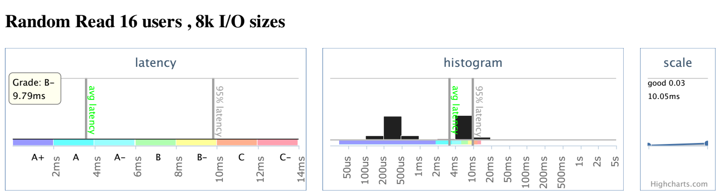
Latency Graph
The latency graph shows two lines, the 'average latency' and the 95th percentile latency. The grade in the latency graph is based off of the 95th percentile latency. This represents the latency of the slowest 5% of the requests. shows that 5% of the IOs were slower. Grades range from 'A+' through 'C-', anything worse than C- is given a 'D'. If the 95% latency line is slower than the range displayed on the chart, then the line is displayed in red at the far right of the chart.
Latency Histogram
The second chart is the I/O histogram chart. It shows the percentage of I/Os in each latency bucket. The average and 95% latency values are also drawn as vertical lines on the graph and labeled. This graph is intended to demonstrate any caching/tiering present in the storage. Presence of bi-modal or tri-modal distributions in the histogram demonstrate the value we are getting out of each tier and the latency we can expect. The grade may not mean much, since it might just indicate the performance of the bottom most tier.
In most cases, we should *not* see this bi-modal or tri-modal behavior on the write latency histograms. Majority of writes should end up in the top tier. If that is not the case, we should review the write-policy (write-back, write-through etc.) This is applicable to tiered as well as traditional storage solutions, which provide NVRAM caching.
Latency Scaling
The third part of the row shows the latency scaling of the storage. The graph shows how the storage performs as the load increases. Scaling is obtained using the 95th percentile latency of the test at a higher user load as below:
- Random Reads: Load increases from 16 to 32 users
- Sequential Reads: Load increases from 1 to 8 users
- Writes: Load increases from 4 to 16 users
The value shown in the scaling widget indicates how much slower the I/O is at a higher load.
Value of 0 means the latency stayed the same.
Value of 1 means the latency went up in proportion to the load thus the throughput stayed the same.
Value over 1 means the throughput was worse at the higher load.